A residential solar concept carried from campaign direction into a working, city-specific digital experience.
CONTEXT
Technical challenge · Delivered October 8, 2026
SCOPE
Concept, visual direction, frontend and interactive implementation
01 / Estimate flow, captured from the unmodified delivered source running locally. This is a real interface screenshot; the challenge data is fictional.Source
Context & challenge
Brightfield Solar is a fictional brand created for a city landing-page technical challenge. Phoenix is the primary experience; two synthetic cities demonstrate how the same page adapts to different content and assumptions.
Solar asks homeowners to connect several unfamiliar ideas: roof suitability, upfront cost, estimated savings and installation. The design task was to turn that complexity into a readable sequence and a concrete way to explore an estimate.
My contribution
Led
Campaign concept, product and visual direction, and final review.
Executed
Frontend and 3D implementation, estimate flow and downloadable estimate presentation.
Workflow
AI-assisted research organization, implementation and review, with Carlos responsible for decisions and validation.
Decisions & delivery
01
Connect the campaign to the product.
The concept and visual direction established a residential, approachable frame. The delivered landing page connects that narrative to an estimate, installation steps and a clearly signposted next action.
02
Make the estimate a sequence.
The implementation moves from monthly bill to desired coverage and then to a summary. An illustrative house supports the experience, while a downloadable PDF lets the reader revisit the numbers.
03
Make limits visible.
The delivered project identifies its fictional assumptions and illustrative estimate. The contact interaction states that no request has been sent. The portfolio makes the challenge status equally explicit.
What this work shows
This case shows the connection between campaign thinking and product implementation: a visual concept becomes more useful when the reader can act on it. It is a completed challenge, with no measured commercial conversion results.
Fictional-brand technical challenge, not a commercial client engagement. Business figures, testimonials, crews and financial assumptions belong to the fictional brief. No campaign performance or customer research outcomes are claimed.
Carlos designed the public website landing-page layout and reviewed the internal platform UI designed by Wallace Paulo.
CONTEXT
Landing-page design and platform approval · 2026
SCOPE
Public landing-page layout; review and approval of Wallace Paulo’s platform UI
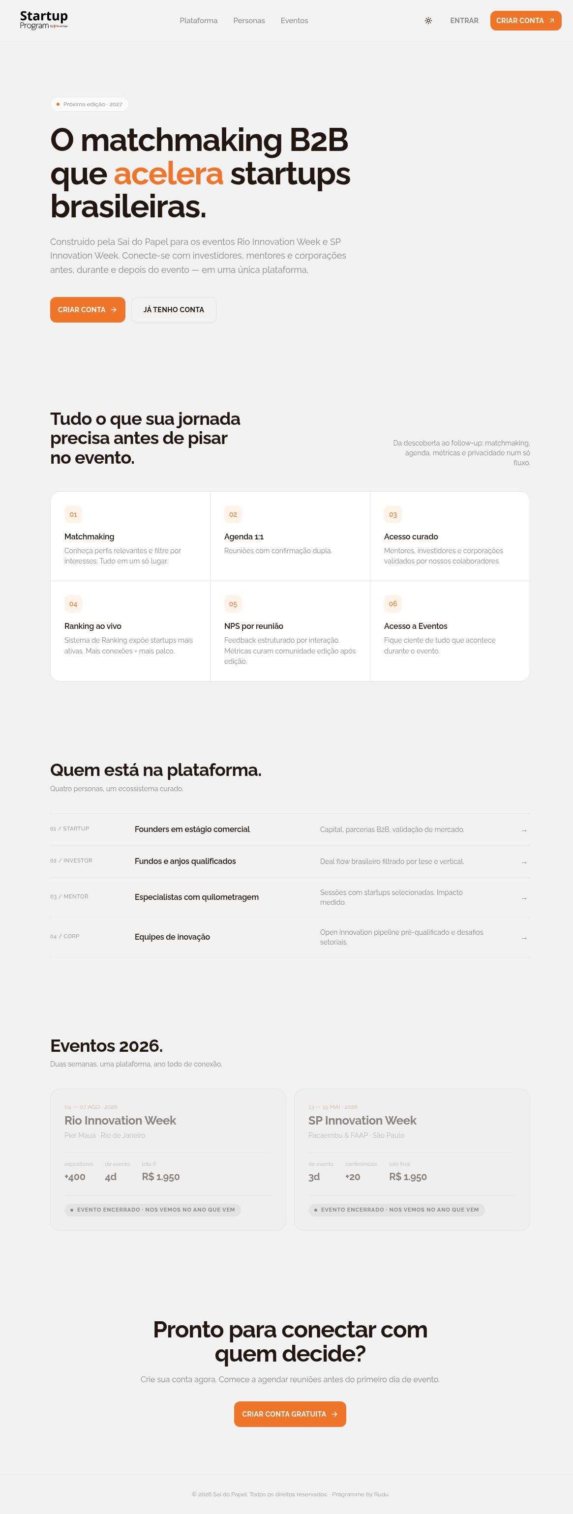
Public landing-page layout by Carlos Henrique. Real desktop capture on October 9, 2026; cropped from the full page. Original Portuguese copy and orange brand colors retained. Capture date is not a delivery date.View full public-page capture
Context & challenge
Startup Program is an innovation-network website and platform. Carlos’s visual-design contribution is limited to the public landing-page layout at app.saidopapel.com.br. Wallace Paulo designed the internal platform UI shown in the supplied historical references.
The public landing page introduces the platform and its participation paths. Carlos designed that landing-page layout and reviewed the platform screens; the internal onboarding and interface design belongs to Wallace Paulo.
My contribution
Designed
Only the layout of the public landing page at app.saidopapel.com.br, as specifically confirmed by Carlos.
Reviewed
Reviewed and approved the internal platform screens. Carlos did not design those layouts.
UI designer
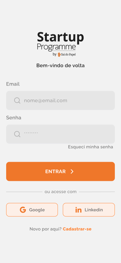
Wallace Paulo designed all supplied internal platform screens, including the historical entry, sign-in and onboarding examples.
Decisions & delivery
01
Design the public introduction.
Carlos confirms authorship of the public landing-page layout. Its current hero introduces B2B matchmaking and separates creating an account from returning to an existing account.
02
Review the internal experience.
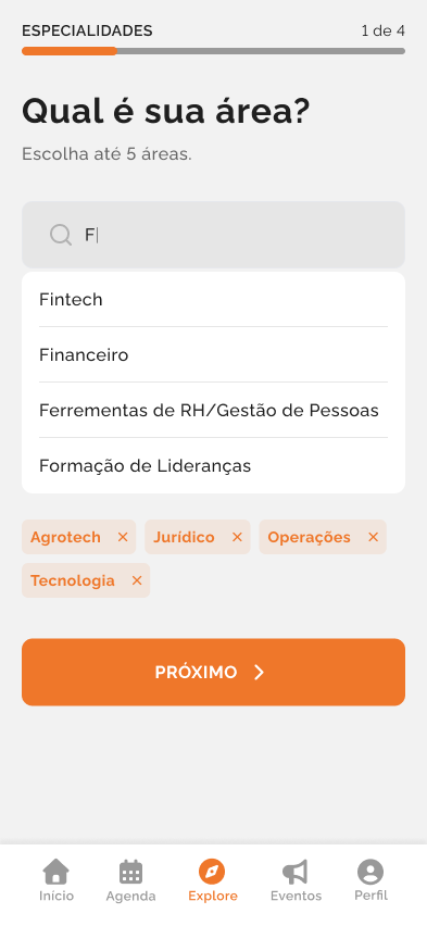
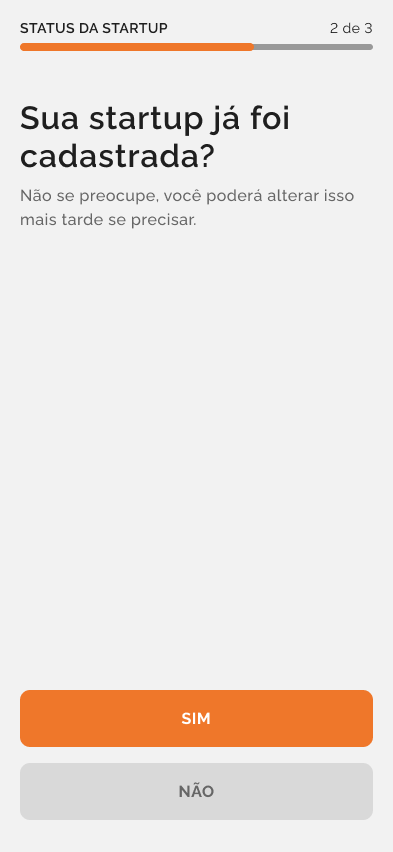
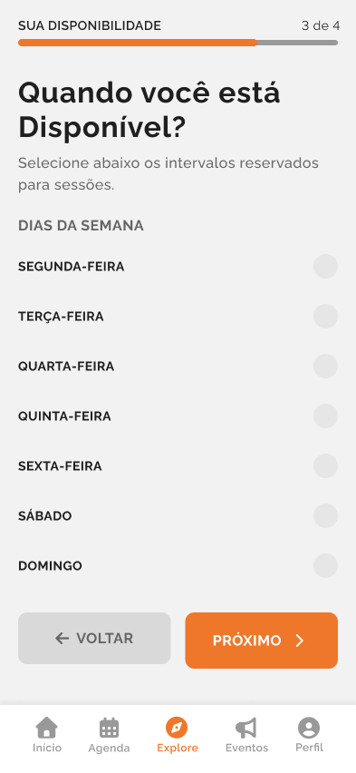
Carlos reviewed and approved the supplied internal screens. The specialty choices, progress indicators and availability states are Wallace Paulo’s UI design, not Carlos’s visual authorship.
03
Keep the evidence and credits distinct.
The supplied mobile entry mockup is a historical platform reference by Wallace Paulo. Similar brand colors and messaging do not establish that it is Carlos’s public landing page.
Platform references / UI by Wallace Paulo
01 / Supplied historical platform entry layout. Platform UI design: Wallace Paulo. Carlos reviewed and approved it. Original brand colors and Portuguese copy retained.View source image 02 / Historical sign-in layout. Empty fields and sample styling are design examples; no credentials or submitted user records are shown. Platform UI design: Wallace Paulo; review and approval: Carlos.View source image 03 / Specialty selection. A single question, visible selections and a numbered progress indicator organize the step. Platform UI design: Wallace Paulo; review and approval: Carlos.View source image 04 / Startup registration status. Historical yes/no decision layout; not a completed registration. Platform UI design: Wallace Paulo; review and approval: Carlos.View source image 05 / Availability step. Historical choices and navigation; no person’s schedule or meeting record is represented. Platform UI design: Wallace Paulo; review and approval: Carlos.View source image
What this work shows
This case distinguishes creating the public landing-page layout from reviewing another designer’s platform UI. Carlos’s role in the internal screens was approval; Wallace Paulo’s visual authorship is explicit alongside each supplied example.
The first image is a real public landing-page capture from October 9, 2026, showing Carlos’s layout. The remaining images are historical internal platform mockups by Wallace Paulo, reviewed and approved by Carlos. No shared authorship of those screens, broader product-design ownership, measured outcome or exact delivery date is claimed.
A people-first credit landing-page study with expressive variable typography, a warm photographic introduction and a complete question-and-answer flow.
CONTEXT
Interface study
SCOPE
Responsive layout, variable-weight title, viewport entrances and sixteen independent accordions
Desktop browser capture of the reconstructed Horizonte landing-page hero, October 9, 2026. The photograph depicts generated fictional people. This documents the current interface, not a historical client website.Open live interface study
Context & challenge
Reconstructed from earlier collaborative frontend work, with a fictional identity, new copy and newly generated photographic assets.
Preserve a human-centered page and its detailed motion sequence while giving the experience an independent ivory-and-violet identity.
My contribution
Executed
Responsive frontend implementation and design-system consistency in earlier work, in collaboration with designers.
Collaborated
The original visual direction belonged to collaborative design work. Sole authorship of the original layouts is not claimed.
Decisions & delivery
01
Keep people at the center.
An older couple and a younger adult introduce the page. The following section keeps text on the left and a smiling portrait on the right, with a separate offset white plate. Warm ivory surfaces and deep violet accents connect both moments.
02
Carry the complete interaction sequence.
A repeatable variable-weight title leads into the original section order: introduction, portrait, sixteen independent questions, the four-step explanation inside question seven, and a four-group footer. Timings and trigger positions follow the source audit; browser-level visual matching is not yet verified.
03
Keep the demonstration clear.
There are no offers, rates, financial calculations, forms or submissions. Local navigation, native question controls and a reduced-motion alternative keep the content readable.
What this work shows
The study connects photographic warmth with precise frontend behavior, retaining the full information structure rather than reducing the original page to a decorative hero.
Fictional brand and people; generated imagery is not customer testimony. Original client identity and photographic assets are excluded. No current financial service, offer, measured outcome or runtime-verified visual equivalence is claimed.
UX decisions, a complete design system and frontend for an esports platform spanning registration through tournament play.
CONTEXT
Esports platform · Collaborative product work
SCOPE
Registrations, matches, brackets, calendars, rankings, prizes, profiles and administration
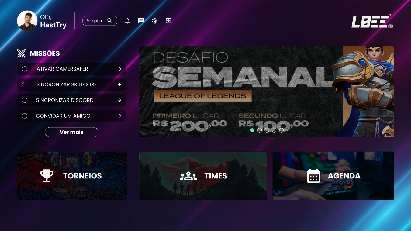
Original reference / Historical design specifically supplied by Carlos. Exact image date and avatar identity are unverified. Displayed greeting, rewards and competition copy belong to the historical design; no current offer or personal record is claimed.View source image
Context & challenge
LBEE brings multiple parts of esports competition into one platform: signing up, following matches and brackets, finding dates and rankings, and managing profiles and tournaments.
A competitive platform serves different tasks for players and administrators. The design challenge is to preserve an understandable experience as those tasks move between public information, participation and management.
My contribution
Owned
UX decisions across the competitive and administrative scope, as reported by Carlos.
Executed
The full design system alongside frontend implementation, as reported by Carlos. Git history separately supports translations, team invitations, modal work and interface fixes.
Team
Broader product and delivery work was collaborative; this case does not attribute every project asset to Carlos.
Decisions & delivery
01
Own the UX across the journey.
Carlos’s confirmed scope included UX decisions for registrations, matches, brackets, calendars, rankings, prizes, profiles and administration. That breadth makes the connections between tasks as important as individual screens.
02
Carry the system into the frontend.
Carlos owned the complete design system and frontend implementation. This combined responsibility connects interface rules with the components that deliver them.
What this work shows
This work connects UX ownership, a complete design system and frontend delivery across a competitive platform. The supplied historical home design documents the visual system and entry points into that product scope.
Carlos reports UX and full design-system ownership. The supplied historical home design is not a current-service screen or a current personal record. Editable Figma sources and measured outcomes remain unavailable. Sole authorship of every component, game image and community photograph is not claimed.
Campaign strategy, base wireframes and scriptwriting for product launches. João Vitor produced the final visual design shown in the archive.
CONTEXT
Product-launch campaigns · Historical team work
SCOPE
Campaign strategy, base wireframes, scripts and copy; Moon Collection and Morcego LightPro team archives
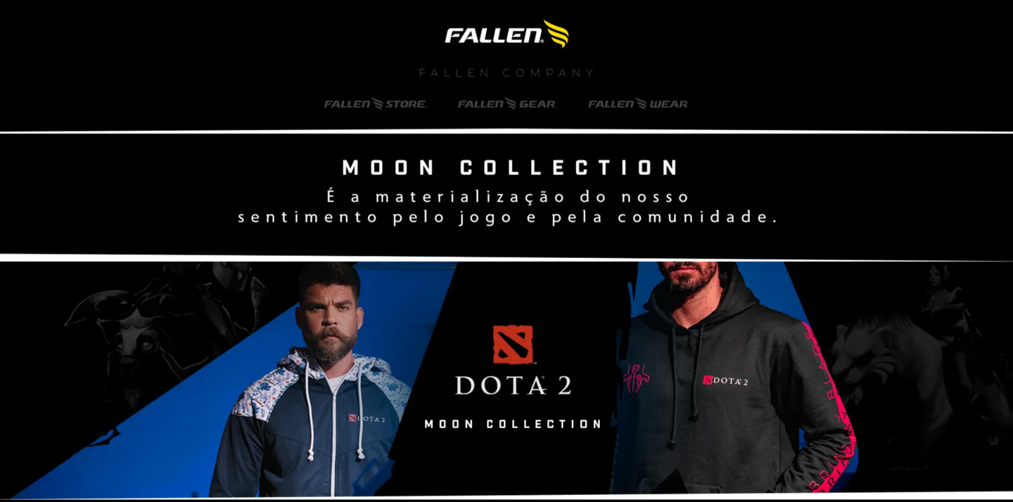
01 / Moon Collection for Dota 2. Original campaign-page header. Visual design / final layouts: João Vitor; Carlos contributed strategy, base wireframes, scripts and copy.Source
Context & challenge
Fallen Store’s launches brought gaming equipment and apparel to an established community. The verified archive includes the Dota 2 Moon Collection and the Morcego LightPro headset landing page.
The communication challenge is to give each product a clear reason to matter: the collection’s connection to a game and its community, or the headset’s benefits during play. Carlos contributed strategy, base wireframes, scripts and copy; João Vitor finalized the layouts.
My contribution
Strategy
Campaign strategy and launch planning with the Fallen Store team.
Wireframes
Base wireframes establishing the initial page structure, as confirmed by Carlos.
Writing
Scriptwriting and campaign copy for the linked launch pieces, including Moon Collection, LightPro and the Eco RGB video, as confirmed by Carlos.
Visual design
Visual design / final layouts: João Vitor. Carlos’s contribution was strategy, base wireframes, scripts and copy; final visual-design and frontend authorship are not claimed.
Decisions & delivery
01
Connect the collection to the community.
The Moon Collection archive introduces the launch through affinity with Dota 2 and its players. The full page continues into collection discovery and community participation. This is evidence of the team’s campaign narrative, rather than proof of individual authorship for each line or layout.
02
Move from the promise to the product.
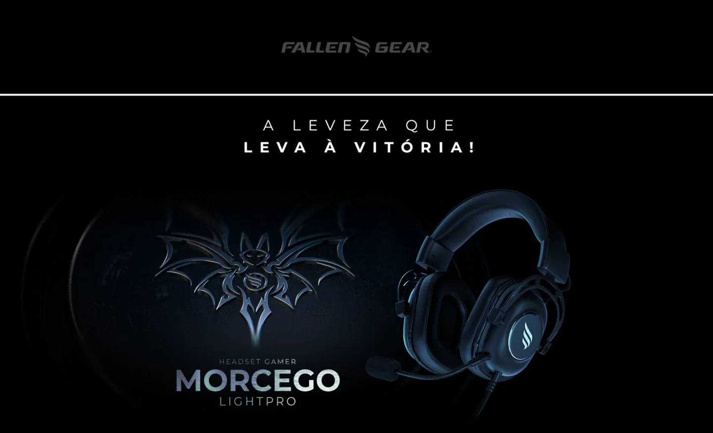
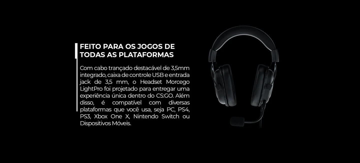
The LightPro page leads with lightness and follows with compatibility, comfort and audio features. The selected crops preserve that promise and one supporting benefit block. They show how campaign copy and product information work together in the team’s output.
A closer look
02 / Morcego LightPro. Original campaign-page hero. Visual design / final layouts: João Vitor; Carlos contributed strategy, base wireframes, scripts and copy.Source 03 / LightPro benefit block. Visual design / final layouts: João Vitor. Static crop of the archived page; product specifications and offers are historical.Source
What this work shows
This work brings the marketing background into the portfolio: connecting a product, its message and its launch. The contribution is strategy, base wireframes, scripts and copy within a team. The finished visuals document João Vitor’s final layouts on that foundation.
João Vitor produced the final visual design. Carlos is credited for strategy, base wireframes, scriptwriting and campaign copy. Photographic, product-design and frontend authorship are not claimed. Specific copy lines are not independently attributed. These are historical campaign artifacts, with no measured sales or conversion claims.
Identity, layout and development for a developer-talent brand, with historical Figma exports documenting the visual direction.
CONTEXT
Identity and website · Circa 2025
SCOPE
Visual identity, page layout and development
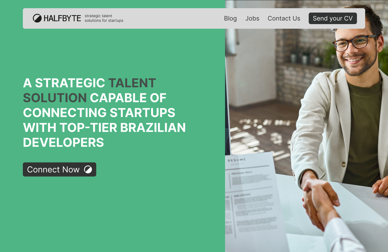
01 / Historical alternative hero from the supplied Figma exports. Identity and layout by Carlos; photography is a third-party asset.View source image
Context & challenge
halfByte connects developer talent with startups. The supplied Figma exports document a green-and-charcoal visual identity, a complete dark page concept and an alternative photographic hero.
The design needs to connect a recognizable identity with a clear introduction to the service, a process explanation and a contact path. The archive makes those composition decisions visible while remaining distinct from the current live website.
My contribution
Owned
Visual identity, layout and development. Carlos explicitly confirms responsibility for all three.
Assets
Photography and third-party marks retain their respective ownership; the case credits Carlos’s identity and interface work.
Decisions & delivery
01
Build recognition around a simple mark.
The supplied logo and graphic variants use a divided circular form. Green, charcoal and restrained neutral tones connect that mark to the page and its graphic treatments.
02
Use contrast to structure the page.
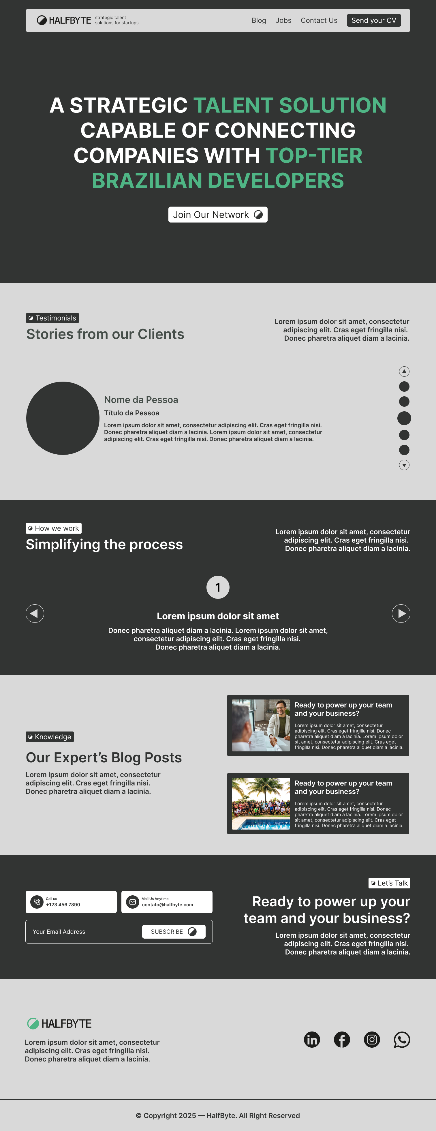
The dark page concept alternates dark and light sections to separate the introduction, client-story specimens, process, editorial content and contact area. The alternative hero explores a split between a green message panel and photography.
03
Carry the direction into development.
Carlos confirms that his responsibility extended from the identity and layout into development. The selected evidence here documents historical design concepts; it does not substitute those concepts for a current live-site capture.
A closer look
02 / Full historical dark-page concept. Sample text and client-story specimens are design content, not verified testimonials or measured results.View source image 03 / Supplied logo export. Original halfByte identity, designed by Carlos.View source image 04 / Supplied palette reference. Original brand colors preserved.View source image 05 / Static graphic variant from the historical Figma archive. No animation is inferred.View source image
What this work shows
The contribution spans identity, page composition and implementation. The archive connects a compact visual mark with a larger editorial hierarchy, while Carlos’s confirmed scope establishes who carried that direction into development.
Carlos confirms identity, layout and development authorship. The estimated activity year is circa 2025, based on his recollection. These are historical Figma design exports, not current live-site screenshots. Sample copy and testimonial specimens are not endorsements or verified outcomes; third-party photographs and marks are not attributed to Carlos.
Site layout and video work for L2Drugs, presented with two approved media loops from the current public website.
CONTEXT
Website layout and video work · Date unconfirmed
SCOPE
Site layout and video work; selected current public-site media
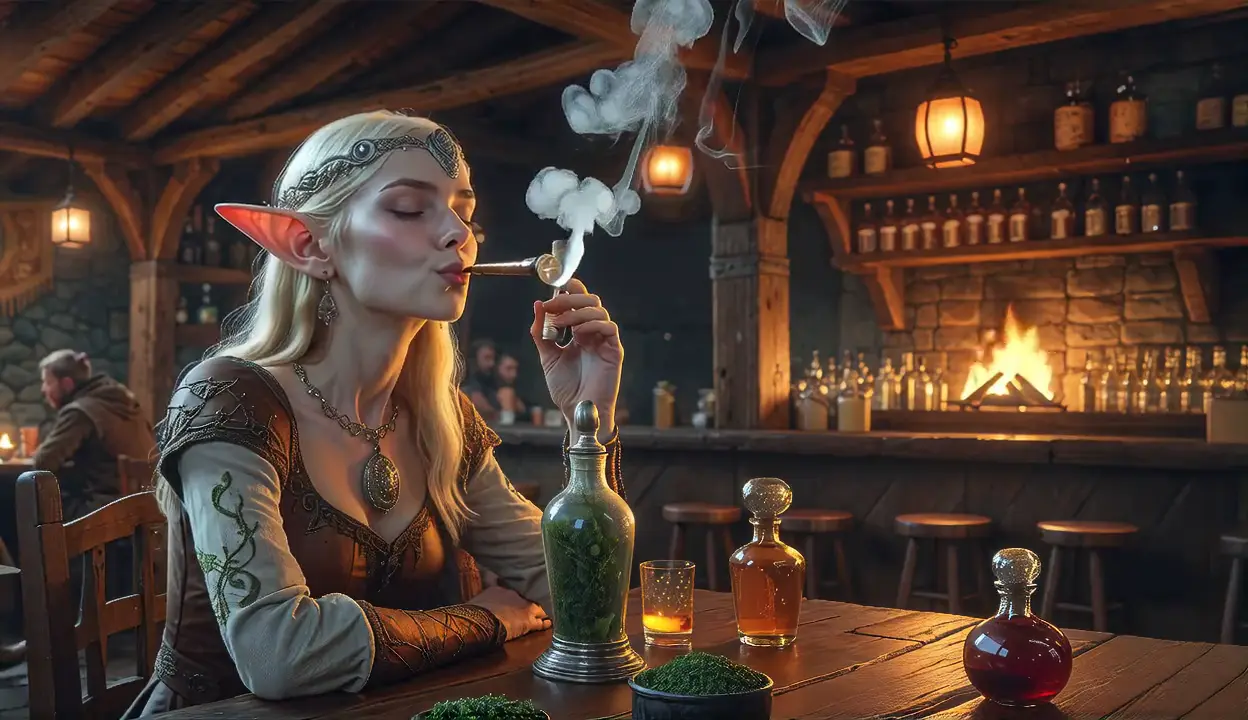
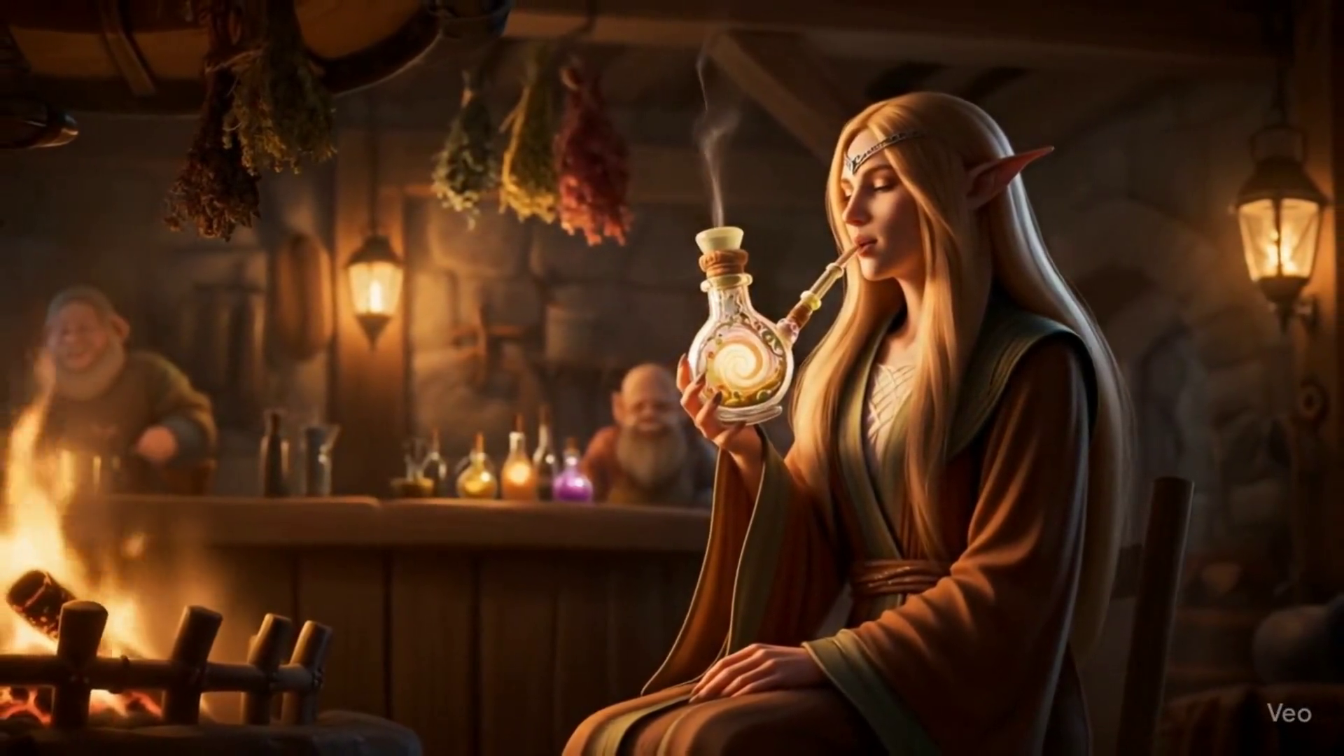
01 / Current public-site hero media. Silent 5.03-second loop; individual clip authorship is unconfirmed. Original imagery and aspect ratio retained.View source image
Context & challenge
L2Drugs is a game-community website. Carlos confirms responsibility for its layout and a video. The approved material supplied for this case consists of two current site-media loops and their original frame references.
Atmospheric media can establish a visual tone, but it also needs a readable and deliberate presentation. The portfolio keeps the supplied scenes complete and gives the reader control over playback.
My contribution
Executed
The site layout and a video, as confirmed by Carlos.
Media credit
The two included loops are current public-site references. Carlos’s statement does not establish individual authorship of both clips.
Assets
Game imagery and third-party assets retain their respective ownership. The download clip’s visible Veo watermark is preserved.
Decisions & delivery
01
Let the original scenes set the tone.
The selected site media use warm tavern interiors and game-character imagery. Both clips are presented in their original proportions and colors, with still frames available for reading and print.
02
Keep playback deliberate.
The portfolio’s silent clips start only when the reader chooses to play them. Posters make the work visible before loading the video; the print presentation uses stills rather than a moving-media dependency.
03
Keep attribution precise.
The layout and video contribution are confirmed. The included current clips are labelled as site-media references because authorship of each individual loop is not yet established. The Veo mark remains visible.
A closer look
02 / Current public-site download media. Silent 8-second loop; individual clip authorship is unconfirmed. The visible Veo watermark is retained.View source image
What this work shows
This case documents a confirmed layout and video contribution alongside the site’s current visual atmosphere. The selected media are useful evidence of the presentation context; they do not establish authorship of every game asset or both current loops.
Carlos confirms the site layout and a video. These are current public-site media, not historical website screenshots. Authorship of each included loop and the design delivery date remain unconfirmed. Server-season dates are not used as project dates. No gameplay, community-size or commercial outcome is claimed.
08 / Architecture / System design / Product engineering
RUDU CRM
An operating system for the sales day.
Carlos designed the architecture, operating logic and implementation of a prospecting CRM. Visual UI by Wallace Paulo; commercial need and reference model from Leonardo Gomes.
CONTEXT
Implemented CRM · Enrichment and discovery planned
SCOPE
Architecture, system design, operating workflows and implementation
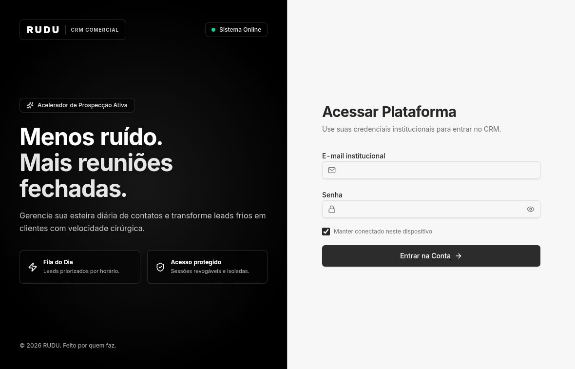
Public, logged-out authentication page captured October 9, 2026. Empty fields; no login, submission or client records. Visual UI: Wallace Paulo. Architecture, operating logic and implementation: Carlos Henrique. This capture documents the entry page, not internal CRM features.View original public capture
Context & challenge
RUDU CRM supports an internal B2B prospecting workflow: a daily queue, company and contact records, interactions, calendar, funnel, imports and analytics. Carlos translated the commercial need into the architecture and working system.
Sales work needs continuity between finding a company, recording contacts and interactions, and deciding the next action. Carlos defined the operating logic and implementation; the phased roadmap separates the implemented CRM from later automation.
My contribution
Engineered
Carlos created all architecture and system design, operating logic and platform implementation. He selected the TinyFish, DeepSeek and scraper strategy and planned its phased evolution.
UI designer
Wallace Paulo created the visual UI from the supplied reference model. The displayed authentication layout is credited to him.
Commercial input
Leonardo Gomes brought the commercial need for prospect discovery and enrichment, together with a reference model.
Decisions & delivery
01
Build the working CRM first.
Phase 1 implements the standard CRM foundation: daily queue, company/contact records, interaction history, calendar, funnel, imports and analytics. The implementation uses Next.js, React and TypeScript, with Tailwind and Radix, Better Auth, Drizzle and Neon Postgres.
02
Make the operating logic explicit.
Carlos owned the system architecture and the workflow that connects records, daily follow-up and interactions. Wallace’s UI translates those flows into the visual interface, using Leonardo’s reference model.
03
Sequence automation by complexity.
Carlos’s planned phase 2 adds automatic enrichment using TinyFish and the DeepSeek API. Planned phase 3 adds automatic prospect discovery through scraping, followed by enrichment. Neither future phase is presented as an integrated capability.
What this work shows
This work shows Carlos’s contribution beyond the visible interface: turning a commercial requirement into system architecture, operating workflows and a functioning CRM, while crediting the designer of its UI.
Implemented scope is supported by a repository assessment and Carlos’s account. Only the public authentication page is shown; internal records and dashboards are omitted. Enrichment and automated prospect discovery remain planned. No measured sales growth, conversion results, delivery date or sole visual-design authorship is claimed.
A complete, people-first multipage interface study with clear navigation, generous typography and an independent ivory-and-violet identity.
CONTEXT
Fictional interface reconstruction
SCOPE
Multipage frontend, accessible navigation, local editorial content and independent visual assets
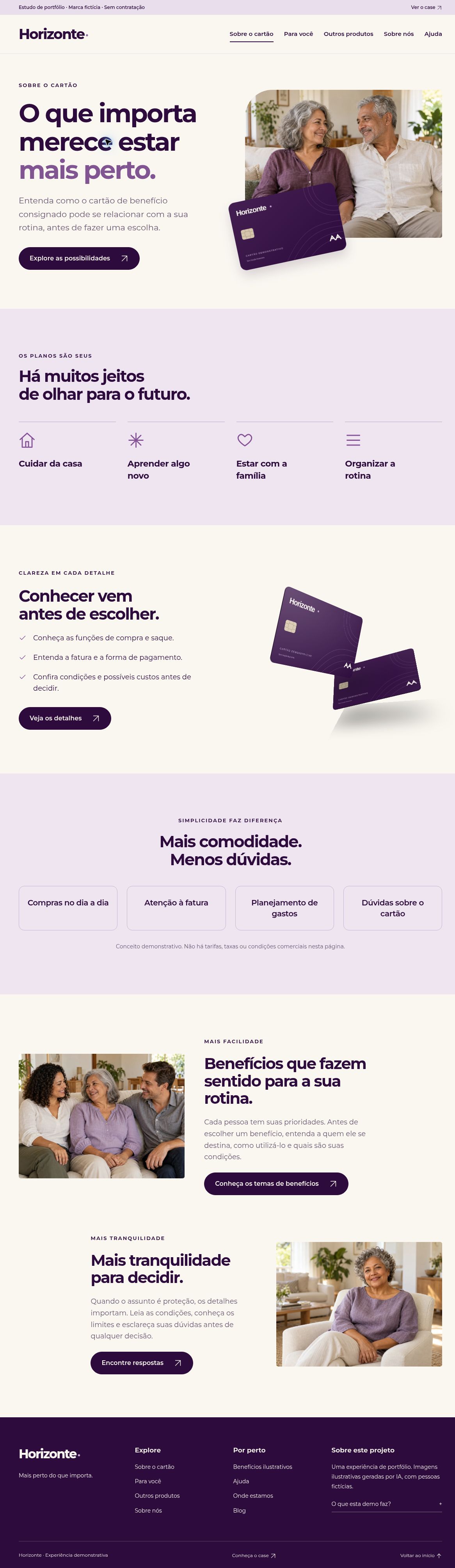
Desktop browser capture of the implemented multipage Horizonte home, October 9, 2026. The person and card are fictional assets created for this reconstruction; this is not a historical client capture.Open multipage demonstration
Context & challenge
A separate multipage reconstruction of earlier collaborative frontend work. It shares the fictional Horizonte identity with the landing-page study while retaining its own pages, navigation and portfolio case.
Make a broad information architecture comfortable to explore, especially for older readers, without reproducing a live financial service or retaining original client branding.
My contribution
Implemented
Responsive frontend reconstruction and interaction behavior, drawing on earlier work in collaboration with designers.
Reframed
Fictional Horizonte identity, independently generated imagery and illustrative content. Sole authorship of the original source layouts is not claimed.
Decisions & delivery
01
Make each destination clear.
Dedicated pages cover the card concept, everyday use, other product examples, the brand story, illustrative benefits, help, fictional locations and a local editorial section. The Para você page also offers direct section anchors.
02
Give reading room.
Large type, clear contrast, generous targets and restrained motion support a calm browsing experience. Native navigation and question controls retain a useful baseline without JavaScript.
03
Keep the demonstration independent.
The neutral card, fictional people and rewritten copy belong to this reconstruction. No financial API, real application, contact submission, banking mark or card-network logo is included.
A closer look
Full home-page browser capture of the implemented reconstruction, October 9, 2026. All people are generated fictional characters; the contents are illustrative portfolio material.View full-page capture Card-information page captured from the implemented reconstruction on October 9, 2026. The alternating compositions and local navigation are visible; imagery and product information are fictional.View full-page capture
What this work shows
A consistent visual system can carry many destinations without making the experience feel dense. This reconstruction demonstrates information hierarchy, responsive implementation and local interaction design.
Fictional brand, people, locations, articles and product examples. No real financial service, endorsement, offer, customer data, measured commercial outcome or verified historical delivery date is claimed. The original collaborative visual authorship remains distinct from this frontend reconstruction.