Horizonte — Multipage experience
More room to understand, one page at a time.
A complete, people-first multipage interface study with clear navigation, generous typography and an independent ivory-and-violet identity.
Fictional interface reconstruction
Multipage frontend, accessible navigation, local editorial content and independent visual assets
Context & challenge
A separate multipage reconstruction of earlier collaborative frontend work. It shares the fictional Horizonte identity with the landing-page study while retaining its own pages, navigation and portfolio case.
Make a broad information architecture comfortable to explore, especially for older readers, without reproducing a live financial service or retaining original client branding.
My contribution
- Implemented
- Responsive frontend reconstruction and interaction behavior, drawing on earlier work in collaboration with designers.
- Reframed
- Fictional Horizonte identity, independently generated imagery and illustrative content. Sole authorship of the original source layouts is not claimed.
Decisions & delivery
Make each destination clear.
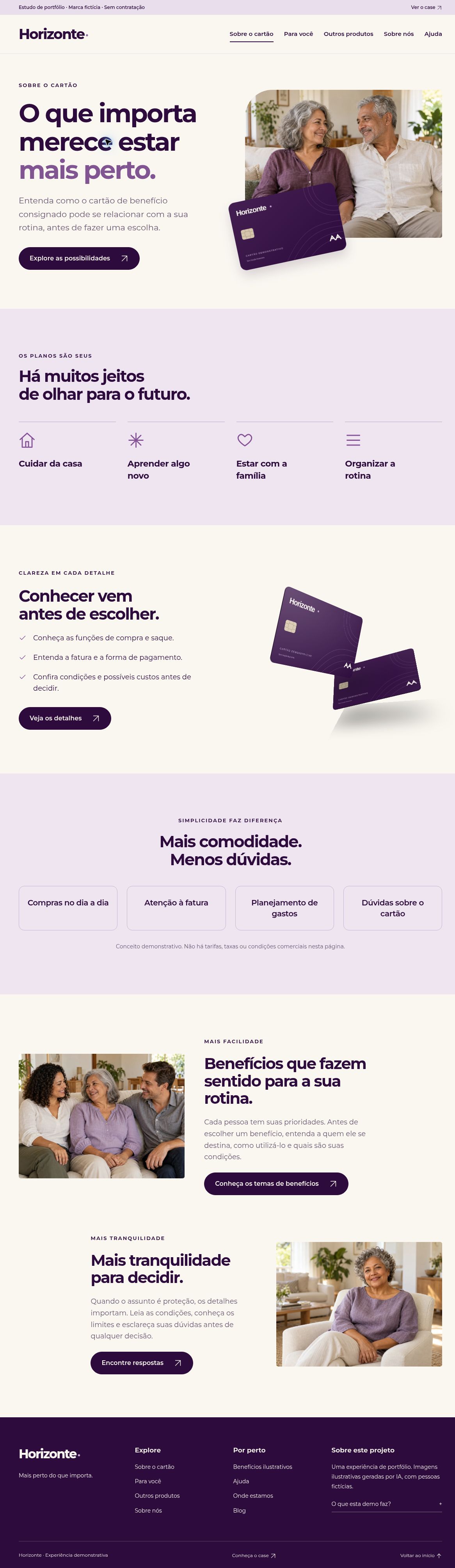
Dedicated pages cover the card concept, everyday use, other product examples, the brand story, illustrative benefits, help, fictional locations and a local editorial section. The Para você page also offers direct section anchors.
Give reading room.
Large type, clear contrast, generous targets and restrained motion support a calm browsing experience. Native navigation and question controls retain a useful baseline without JavaScript.
Keep the demonstration independent.
The neutral card, fictional people and rewritten copy belong to this reconstruction. No financial API, real application, contact submission, banking mark or card-network logo is included.
A closer look

What this work shows
A consistent visual system can carry many destinations without making the experience feel dense. This reconstruction demonstrates information hierarchy, responsive implementation and local interaction design.
Fictional brand, people, locations, articles and product examples. No real financial service, endorsement, offer, customer data, measured commercial outcome or verified historical delivery date is claimed. The original collaborative visual authorship remains distinct from this frontend reconstruction.